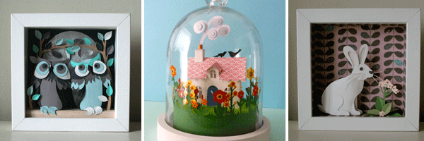
Helen Musselwhite's work captures you from the second you lay your eyes on it. The longer and closer you look at them you are drawn into her world of creatures, characters and landscapes that amaze you, and with such a delicate construction and design you just cant help but fall in love with them.
We are delighted to represent Helen and to offer you a stunning collection of new pieces, and a rather interesting interview with the artist herself..... enjoy.....
BB: When did you first start working in 3D? Was this always the case or did you start in a different style?
I started working in this way about 5 years ago.
I studied graphics and illustration at art college in the dark ages before the Mac! I used to use gouache and was into screen printing.
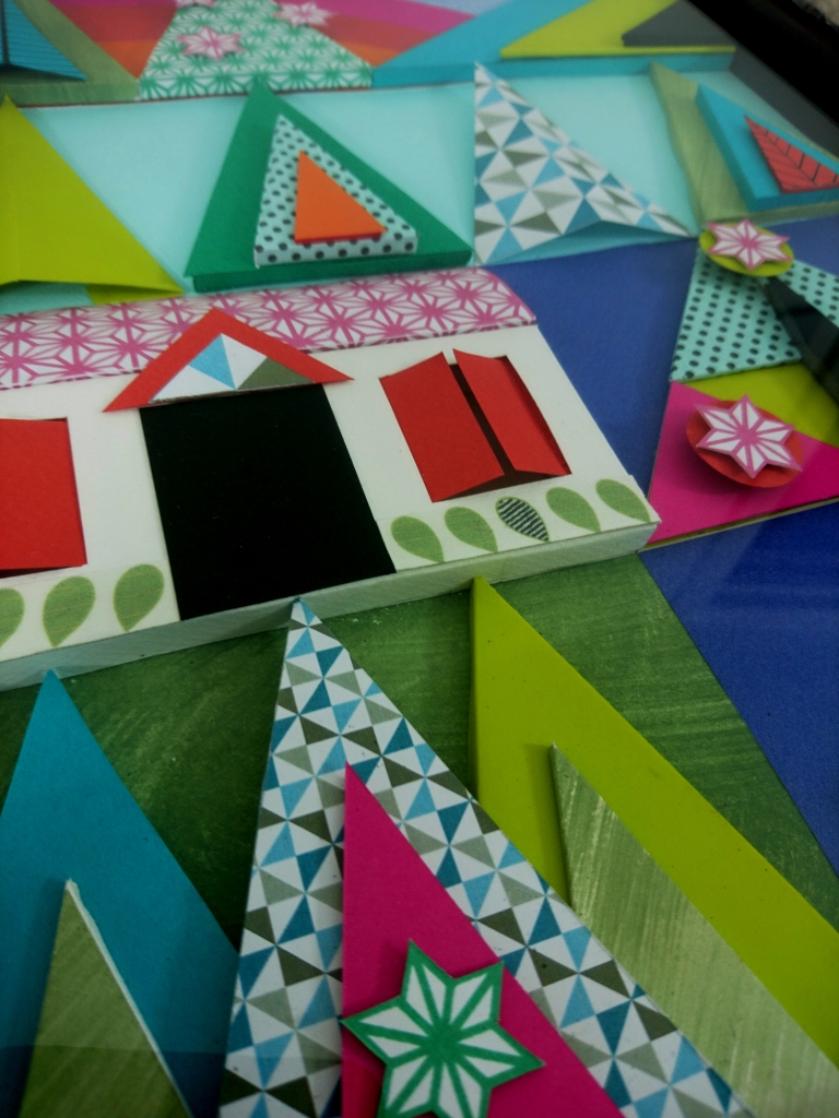
My style has always been quite bold and graphic and as I didn’t learn to use programs like illustrator and photoshop I had to find a way of working and a medium that was equally bold and quick (ha ha) and easily obtainable. Paper was/ is that medium and the layering, scoring, folding and use of pattern literally adds another dimension.
BB: Can you tell us a little about the materials you use to construct your pieces and your reasons behind this.
I use paper in my work because I like it qualities and how I can utilize them also the fact it comes in different weights, textures and obviously colours.
Just by cutting a shape you can immediately create but I love that you can take it further buy folding scoring, bending, curling, painting adding texture and line.
BB: You also work as a commercial artist can you tell us a little bit about some of the clients and projects you have worked on, and about the up’s and downs of working commercially.
In the past couple of years I’ve done a few commercial projects, Its so exciting to get an email on my website asking if I’d be interested I say a book cover or a advertising campaign.
Clients have included Stella McCartney, Smythson, AOL, Nokia, Cadburys and Random House.
The advertising campaign’s have been the most intense to work on as they move really quickly and are very demanding, a book jacket illustration is no less demanding but usually moves at a slower pace.
BB: Are there any commercial clients or companies out there that you would like to work with either for a campaign or in a collaborative way?
I’ve recently started to use Farrow and Ball paints in my work, painting watercolour papers with their beautiful range of colours I think I have every colour in a tester pot, (not that I’m addicted or anything….)
The nice people from the Bath branch have asked me to exhibit some work in the shop last December and it would be wonderful to develop more of an association with them as a brand….
BB: Your dome pieces are pretty spectacular – did you find constructing these more of a challenge than your framed pieces?
The domes are a bit more of a challenge as they are in the round so there is no place to hide!
I have to think about joins in the paper and the construction in a mixture of flat and 3D. I‘ve admired (from afar) taxidermy tableau ever since I saw an amazing exhibition in Brighton when I was about 5 or 6 of lots of stuffed animals arranged in various settings (kittens getting married!) by an exocentric Victorian gentleman called Walter Potter. Stuffed animals aren’t an option and I don’t want anthropomorphisize animals but something about the Potter pieces has stayed with me and I think my domes and more recently a cupboard with a scene in lit by LEDs are inspired by Potter.

BB: Are there any illustrators, artists, designers out there that are inspiring you at the moment?
Loads, I spend a lot of (probably too much) time on the web and find lots to admire and be inspired by.
In particular a husband and wife team of Illustrators working in the 1950’s called Martin and Alice Provensen, the printmaker Robert Tavener, Eyvind Earle, Tom Eckersley a prolific graphic designer and illustrator working from the 1940s’ – 1980s’ the list goes on and on…
BB: Which website’s are you visiting a lot at the moment?
www.fearsnadkahn.com lots of travel posters from mid 20th century
www.graphis.com/arcive/magazines
www.caughtbytheriver.net
BB: Tell us about your workspace
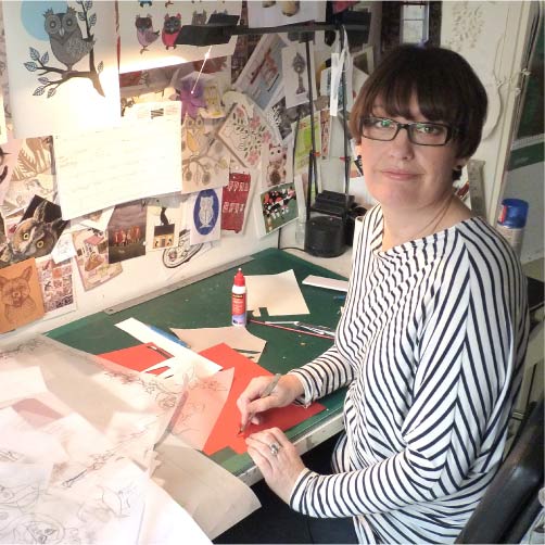
I work from home in what used to be a dining room, when we moved into the house we did a bit of work and I nabbed this room as mine!
Its got a long desk that’s usually unrecognisble, wish I was tidier, tried just doesn’t work, paper drawers and cupboards (thank you Ikea) lots of books a Mac and printer/scanner and a barrier made from a nest of tables at the door to stop our dog Earl from raiding the paper bin and waging his tail when there un-glued artworks around.

BB: Do you have any interesting projects coming up?
I’m working on a book cover at the moment and have a couple of exhibitions in 2012 that I need to get working on.
I’ve also recently started to be represented by Handsome Frank illustration agency so I’m hoping to work on some projects with them next year….
BB: If we could have asked you any question in the interview what would it have been & what would your answer have been?
Where would you like to be right now?
In a little cottage with an open fire, Ercol furniture and a meal made with vege from my garden and a trout caught from the river outside my front door oh and wifi please.


