Discover the creator of some of your favorite animated characters.....
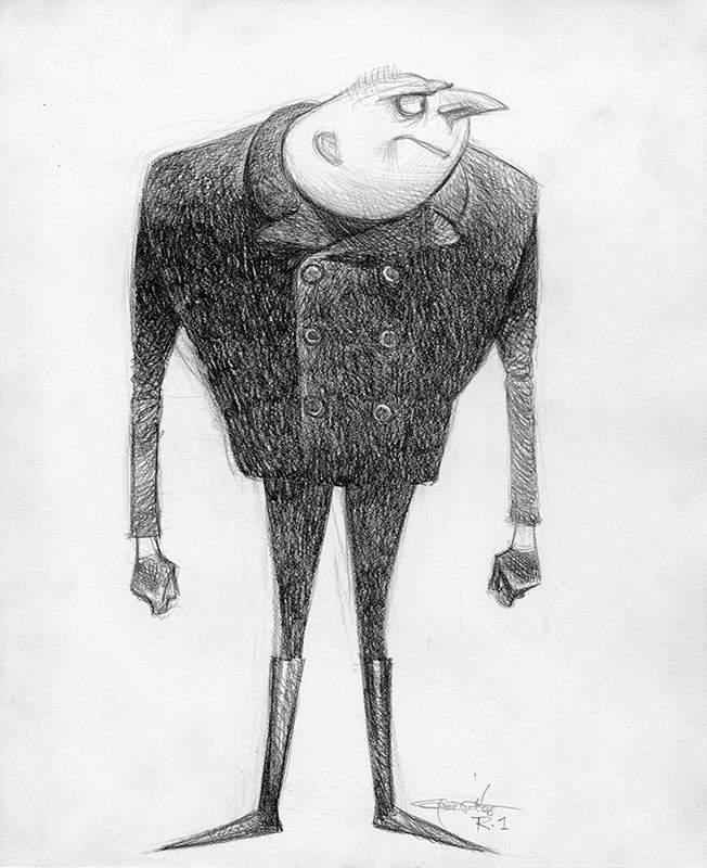
Character Development artworks by Carter Goodrich - Despicable Me
I have to thank one of my previous New Discoveries artists for introducing me to Carter Goodrich, in my interview with Timothy Banks he mentions Carter's New Yorker covers as one of his inspirations. I was blown away by his amazing artworks, only to discover I knew his work already, just never his name.
Our home has been full of artwork from animated films for many years, since before we even had kids, through a passion for the concept artwork and the final film, so i was really excited when i discovered that Carter Goodrich was responsible for designing some of my favorite animated characters.
From the magnificent Despicable Me to the iconic Finding Nemo, Carter has been part of shaping characters which will stand the test of time, and entertain generations to come. A job like this is many illustrators dream, and it is a rare talent that can make rats so adorable!
I had a million questions for Carter and was completely honoured and delighted when he agreed to ask a few of them for me! (think he is a bit busy for a million questions!).
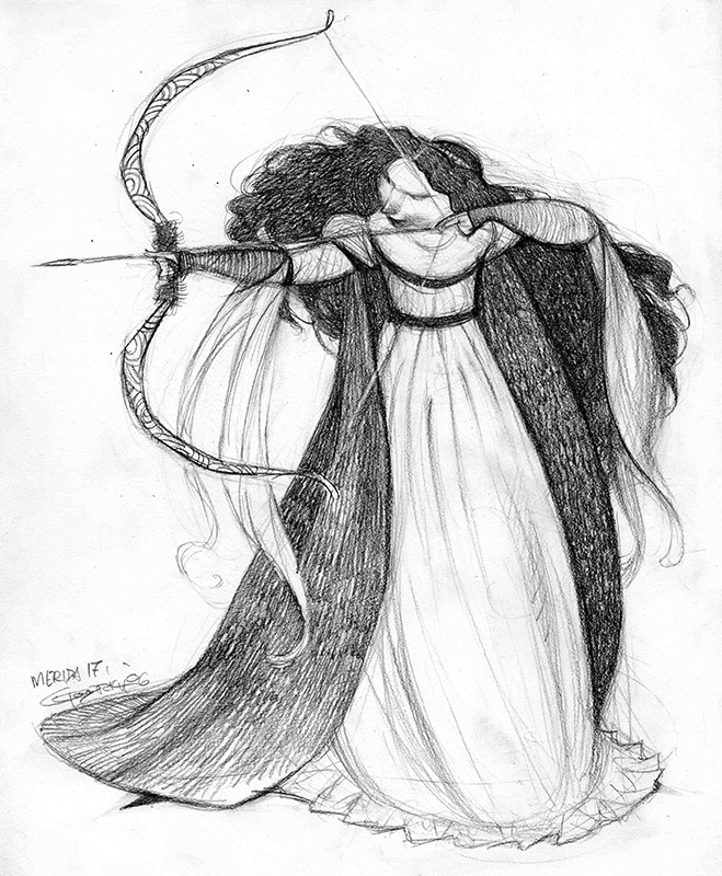
Brave, Carter Goodrich
I have always been really interested in how artists find their way into illustration, often not realising that being an illustrator is even a job! It's always a very interesting journey from early influences to professional style and I wanted to know how Carter evolved into the artist he is now....
I suppose that goes back to my first year in art school (Rhode Island School of Design). Like every other wide eyed freshman, I didn't have any idea where I was headed, and the only major that made any sense was illustration. I wanted to be able to make a living when I got out, and it was the only path that seemed reasonable. My father was a painter, and I spent a lot of time in his studio as a little kid, studying his art books and his library of illustrated volumes; classics that were illustrated by NC Wyeth and Arthur Rackham, mostly. I was in love with their artwork. The extraordinary drawing and gorgeous painting. It stayed with me.
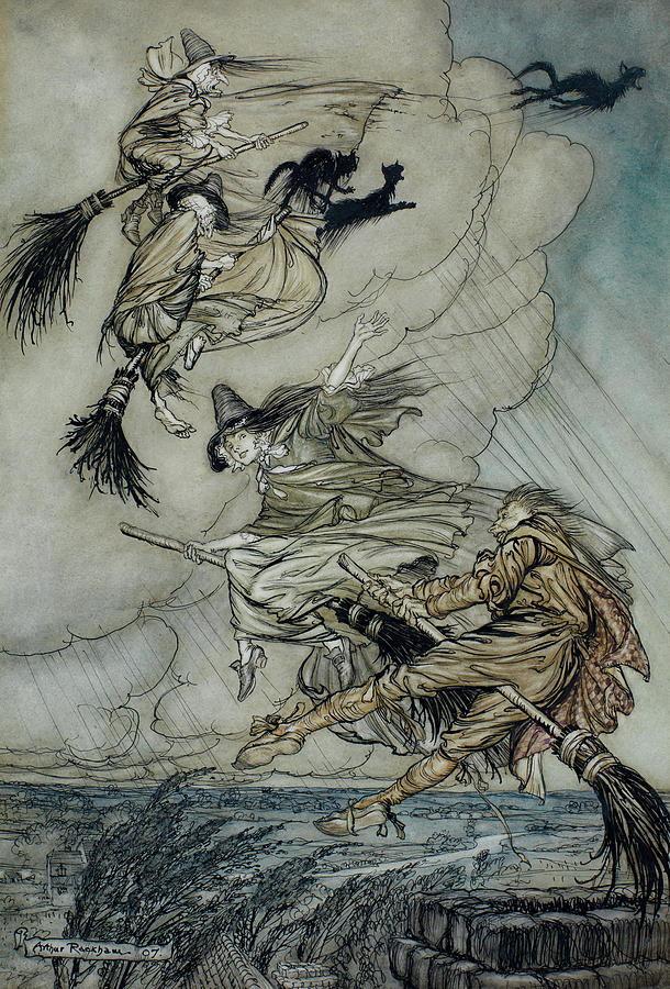
Arthur Rackham
As time passed the work of other artists came to my attention, but I always loved the work of anyone who demonstrated a great knowledge of drawing. In New York I met Peter DeSeve, who's work and passions mirrored my own, and we became great friends and still are to this day. Our careers have been in lockstep ever since. We also had the same influences; A.B. Frost, Daumier, Heinrich Kley, etc. All the greats.
As for contemporaries, I was very much taken with Brad Holland's work. There were others, but names escape me now. I think as time moved on, I began to pay more attention to the work of people who did not work as commercial artists. But one remained, and still does today, more than ever; the great Saul Steinberg. My fascination with fine, traditional drawing morphed into an interest in more wildly creative, loose, less tortured work, and Steinberg remains King of that realm.
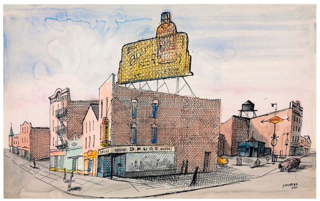
Saul Steinberg, North Carolina, 1955. Ink and watercolor on paper
Can you tell me a little more about your education experience?
I remember my friends and I were worried that RISD might not be "conventional" enough to help us out in terms of graduating with a proper, polished portfolio; ready to wow the art directors at magazines and advertising agencies. At the time I was there, the school leaned more heavily on taking the opportunity of being in art school to explore and fumble around as much as we could, rather than put together a precise and impressive collection of samples of finished work. We were to put together our portfolios on our own time, after we graduated. It was a wise approach, and I'm grateful for it now. I remember specific teachers more than the classes I took. A few giants who made the four years worth it.
My favorite classes were life drawing, which went all day. RISD is a beautiful campus, and the old buildings had wonderful life drawing studios. To me, it was absolute heaven. To go from high school, which I hated, to spending the whole day in a dusty life drawing class, drawing from a nude model, drinking coffee, smoking cigarettes and being treated like an adult and a bonafide artist was an experience I'll never forget.
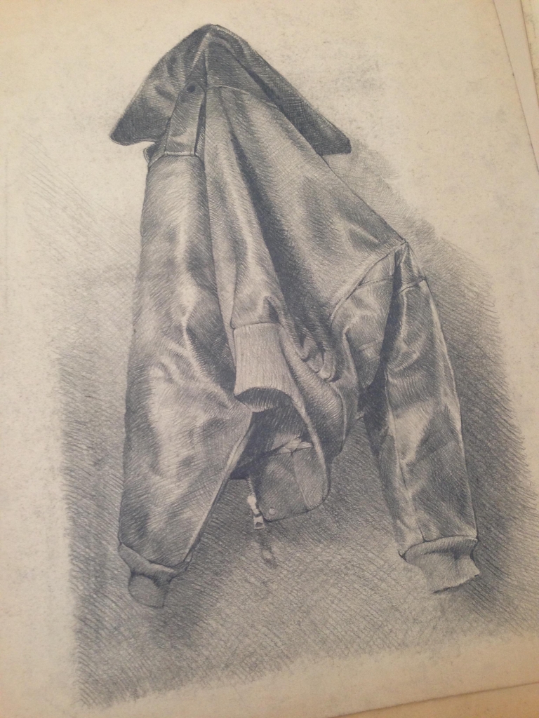
Drawing by Carter Goodrich from his time at RISD
What was it like getting into the real working world after graduation?
After I graduated, I worked as a carpenter for a couple of years, while I slowly put together my portfolio which was keyed on how I wanted to approach illustration work. A good friend had moved to New York and invited me to join him and share studio space with him. This was 1983, and believe it or not, a penniless artist could find not only a nice, affordable apartment in Brooklyn, but also additional work space in MANHATTAN! I was so lucky to have been there when I was. I feel badly for young artists starting out today, with no chance of being able to afford living in the city now. Anyway, it didn't take long to find work, there were so many trade magazines, illustration jobs were plentiful and I could afford to scrape by in that grand city. Gradually, the jobs got better and better, in higher profile magazines, and I was on my way.
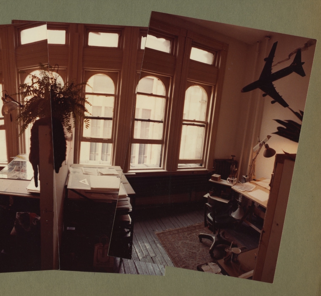
Brooklyn Studio
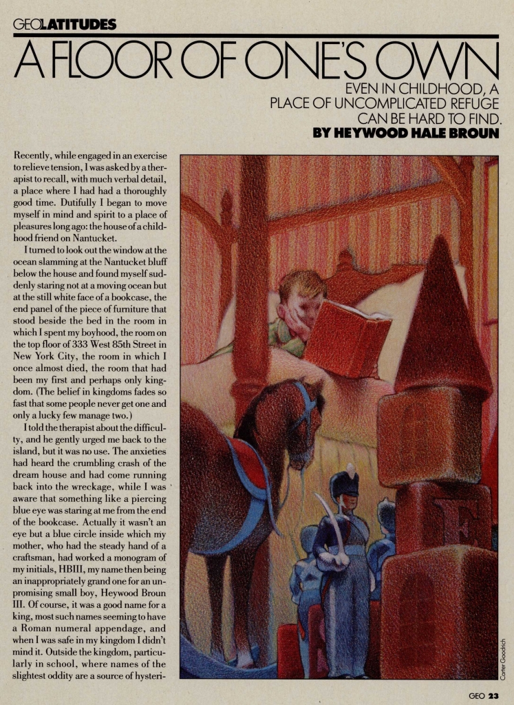
Carter Goodrich early editorial commission
Your character development artworks are absolutely stunning, can you tell us about how you fell into this line of work?
That was a timely and wonderful accident. Not long after my first NYer cover, I was contacted by DreamWorks, who were gearing up to start their first feature animated movie, Prince of Egypt. They wanted to know if I was interested in contributing character designs to the project. I had no idea what animation was about, and never had any inclination to work in that field, but the offer landed at a time when I was burning out on the daily grind of editorial illustration, and needed a change. As a kid, I did like Warner Brothers cartoons, and the occasional Disney feature (though my father dismissed Disney as "saccharine crap", and being a loyal son with a great love for my dad, I adopted his opinion as my own). Ironically, that attitude prevented me from following the work of Disney artists, and that's what gave me my opportunity to work on that first movie with DreamWorks.
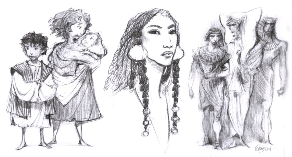
The fact that I came in with no knowledge of the great animation development artists, and the past "looks" of animated movies is what seemed to intrigue them. They were looking for new ideas, and a different style, and I seemed to fit that need. The work I gave them was hopelessly raw and I'm grateful they let me stay on, because I met and befriended two giants in character design, Nico Marlet and Carlos Grangel. Those two knew the ropes, and taught me so much. They also brought European design sensibilities to the table, so it was a great time to dive in. Once again, I was so lucky with timing. After that project, character design took over as the lion's share of my work. Other projects with other studios began to come in, and eventually I moved out to LA, where I still am today.
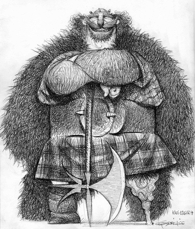
Character Development by Carter Goodrich, Brave, Disney Pixar
Which of the characters you have created has been your favourite to work on?
That's very tough to answer. There have been good ones and very poor ones, and it's a constant reminder that I'm not a consistently good character designer. I think probably the two most successful projects for me have been Despicable Me and Ratatouille. In both those cases I was allowed to spend a great deal of time on pretty much all of the characters, and for the most part, the finished designs are very close to what I submitted, and both movies are brilliant in my opinion. The level of talent and the story telling on those movies was phenomenal. So I guess I'm most proud to have worked on them. No specific characters, though. Well, maybe the food critic in Ratatouille.
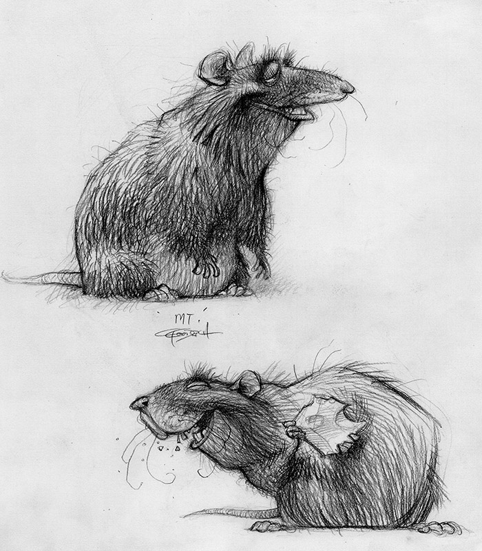
Character Development Ratatouille, Disney Pixar.
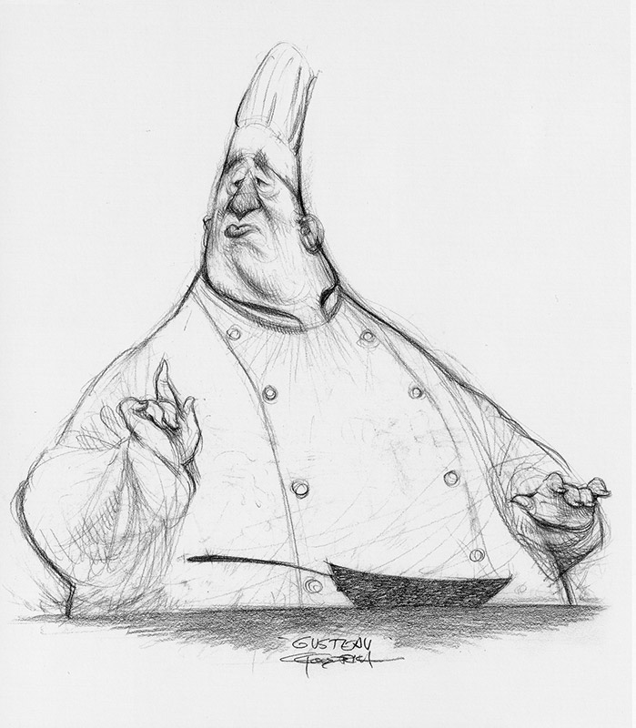
Can you tell us a little about the process of character development for the big screen? How much control do you have and how much is directed by the studios?
Well, I can only control what I draw, and I take my orders from the director in terms of who and what they're looking for. I think I work best very early on, when they're searching for a character but they haven't narrowed down what it is they want, exactly. In other words, it's better if they don't begin with something like, "We want a really tall, skinny guy with this kind of hairstyle and a big nose". If it's wide open, that allows me to do more than just design a character. It allows me to imagine who that character might be. What's "inside" the character is what dictates how the design looks.
I tend to channel people I've known, or worked with, or seen in old movies, etc., as a jumping off point. A successful design tends to offer an actual personality that feels familiar to people, but isn't another retread of a character we've all seen too often already. Of course, that personality must be in line with the character's role in the story.
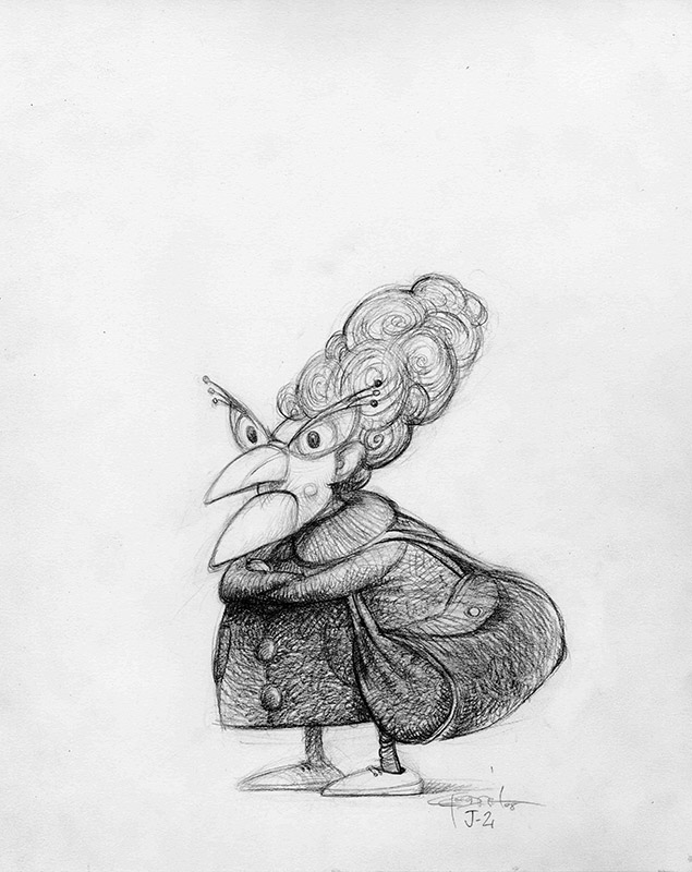
Carter Goodrich for Despicable Me
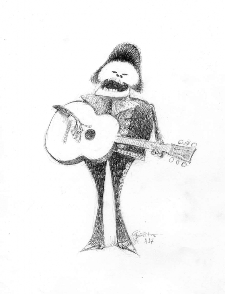
Character Development for Coco by Carter Goodrich
The New Yorker Covers are what first drew me to your work. They are a magnificent master class in editorial illustration. How did this partnership start?
My first published cover was in 1994. The last one I did was in 2017, I believe, and I haven't had much luck getting a sketch by them since then. The New Yorker is the only venue of its kind in the United States, where the image is always a painting, not a photo, and there is never any type other than the name of the magazine. The image does not correspond with any specific content in the issue. It's a stand alone piece. My concern lately is that the magazine has drifted too far into topical images, which is closer to the covers of Time Magazine than those of the NYer of old. I think that direction moves it away from offering timeless images that will hold up decades from now.
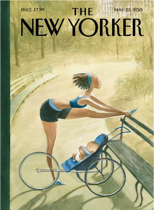
Which of the New Yorker covers are your favourites?
My favorite cover artists are Steinberg and Arthur Getz. All of theirs. But if you're asking me about my own covers, I guess I like the birthday party for little kids, "Everybody Who's Anybody", and the one of the gallery opening, the name of which escapes me. I think I named it "Good Turn-out", but they might have renamed it.
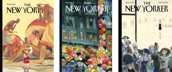
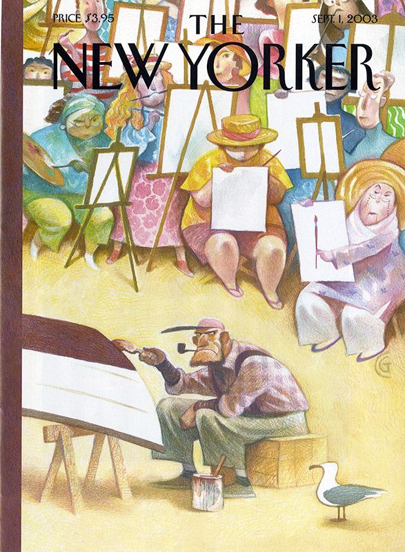
Can you tell me a little bit about how your creative process and the techniques and materials you use?
I work with the old tools. Nothing digital. I used to use colored pencil over a finished watercolor painting. These days I just use watercolor. My wrist began to give out with the colored pencils, though I'm thinking about trying to use them again in my next book. For the character design work, I just use good old drawing pencils and a pad of paper, though I do scan them because I like how they look in a rich black and white scan.
I have a studio in my house. Now and then I've been invited to work onsite with various studios, but I prefer working in my own studio. I like the commute.
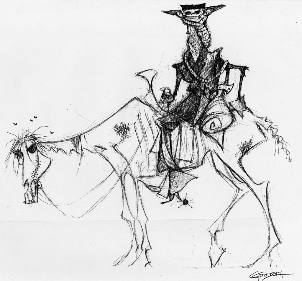
Sweating Bullets by Carter Goodrich
Are there any organisations or individuals with whom you would like to work with on a creative project? If so what is it that draws you to them?
Right now I'm working with some people who want to pursue one of my books as an animated feature. It means I'd get to have a much bigger creative role in the project, and I'm curious what that would be like. We're very early on in the process. If it happens, I hope to contact some of my friends whom I've worked with before to see if they might be interested in working on it. We'll see.
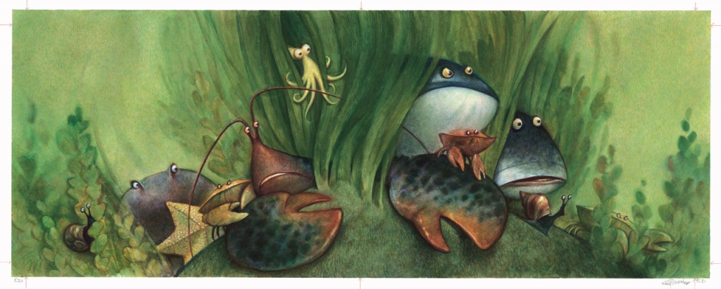
Artwork from The Hermit Crab by Carter Goodrich
You have created an impressive collection of children's books which was your favourite and what advice would you give to illustrators who would like a career in children's books?
Again, that's a difficult question to answer. There are aspects to all of them that I like, and many things I don't like. Each one has been a different experiment for me, and I've tried to change it up a little as to how I visually approach each one. As for the stories, I've learned a tremendous amount from my editor, Justin Chanda. How to keep distilling and reshaping a very simple story into its essence. It's a long process, and a difficult one. I will say that I don't feel like I've really succeeded in a way that I can look at any one of them and feel, "Yes. That's exactly what I was hoping to do. That's exactly how I wanted it to look." All I really can see are the mistakes and missed opportunities. On the other hand, maybe that's what I've learned; that I will always feel like that, and that's how it should be.
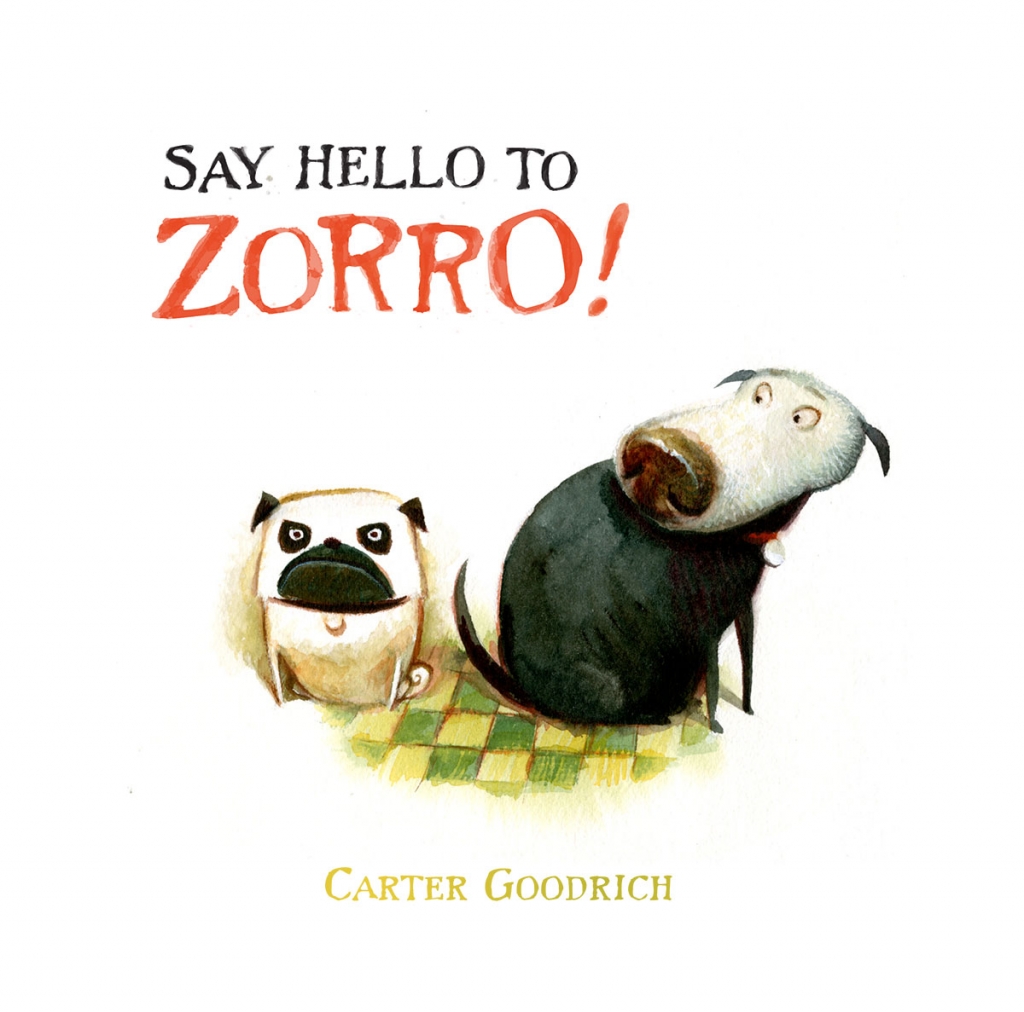

Illustrations from books by Carter Goodrich
We have spoken to many artist about their Lockdown and Pandemic experience, they have responded in different ways, can you tell us a little about what it has been like for you?
Nightmare. I have never felt so depressed and hopeless as I do now. That comes not just from the pandemic, but from the impossible horror show of Trump and all the god awful people who support him, and all the fools who adore and vote for him. It's been an awakening as to just who almost half my fellow countrymen are. We are a deeply racist nation, ignorant and narrow minded. Savage and dangerous, and we have opened the door wide for a fascist regime, which makes me sick at heart. I'm terrified that we cannot correct what has already begun. It's a struggle to work, now, but when I finally get past the hellish noise of everything that's happening all around me, and find myself losing track of time as I work on something, I can still find some peace and even a little joy.
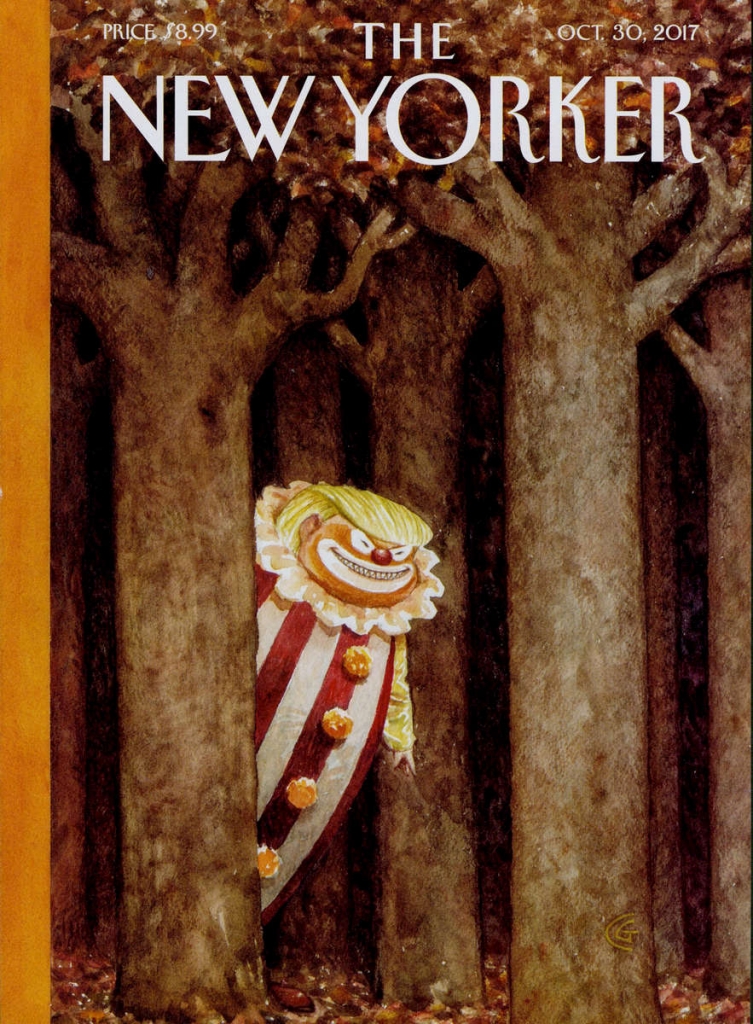
The New Yorker cover by Carter Goodrich
What and absolute pleasure it has been to put this piece together! Discovering Carters prolific catalogue of character development has been such a joy, and exploring the New Yorker covers deeper simply fascinating!
If you would like to see more of Carters work (and I really do recommend you do!) pop over to his website at cartergoodrich.com
As always if you enjoyed this blog post please share it and comment below to tell us what you thought!
Alice xxx
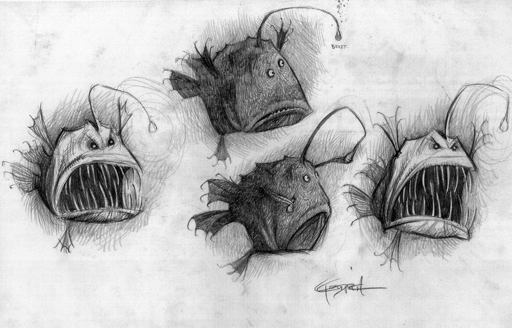
Carter Goodrich for Finding Nemo


